
Systems
in Motion.
A working manifesto for a modular infrastructure brand. Not a guideline. A way of seeing.
Operational, not decorative. Every element exists to make a complex system legible.
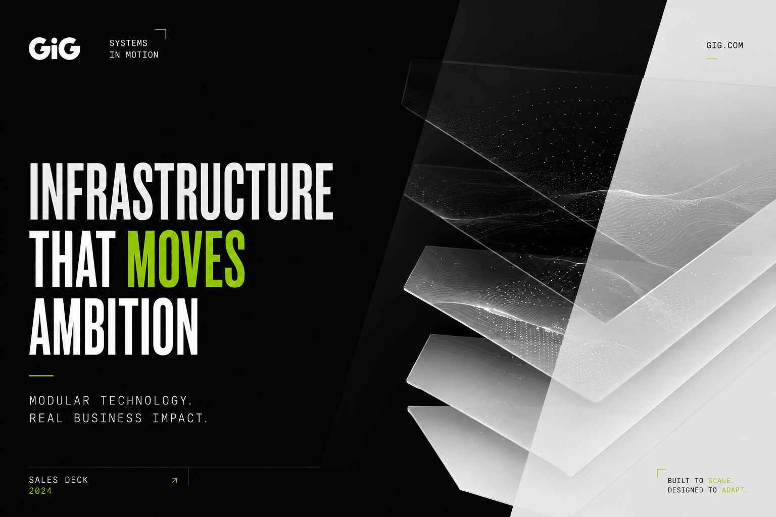
Modular by construction. The brand assembles in layers — surfaces, signals, motion — never as a single static object.
Cinematic in pacing. We treat the experience as a film, not a deck: framing, restraint, rhythm.
- Generic SaaS softness
- Gradient tech aesthetics
- Safe B2B layouts
- Casino & sportsbook clichés
- Crypto / cyberpunk overload
- Dashboard maximalism
- Operational elegance
- Architectural typography
- Cinematic pacing
- Modular composition
- Restrained signal color
- Editorial restraint
One tagline. Three syllables of intent. The voice is concise, modern, technical, elegant. It never sells. It states.
All systems operational. Last sync 02s ago.
Built to move modern gaming forward.
Request rejected upstream. Retry queued.
We design infrastructure the way studios design products.
The palette is reduced on purpose. Black and off-white create the architecture. Signal Green is never decoration — it appears where a system activates, confirms or asks for attention.
Type is the architecture of the page. Oversized headlines anchor every section, metadata labels keep the system technical, body copy stays out of the way. The grid is the type — not the other way around.
Restrained, paced, atmospheric. Movement signals that something is alive — it never asks for applause.
- CoreOperational
- SportsbookOperational
- PAMOperational
- Frontend CDNOperational
- Data & AIDegraded · advisory
- Restraint
- Black / white contrast
- Negative space
- Layered depth
- Cinematic pacing
- Architectural typography
- Signal as activation
- Generic SaaS softness
- Crypto / web3 aesthetics
- Gamer culture visuals
- Dashboard overload
- Random gradients
- Startup clichés
- Noisy interfaces
The identity isn't a logo on a page. It's the same operating language carried across decks, product surfaces, campaigns, social and atmosphere — same grid, same restraint, same signal.
The brand isn't a logo, a palette, or a layout. It's how the system behaves while you watch it work.